微信统计图
微信统计图是采用apache echarts 来实现的。
需要定义
1) 维度,即数据集的列。
2) 格式选项,及JSON对象,是apache echarts的图形选项。
<FORMAT STYLE="WXCHART" CODE="WXCHART" NAME="WXCHART" WIDTH="" HEIGHT="300">
<OBJECT TYPE="COL" CODE="c_zcfl_ecode" X="0" Y="0" WIDTH="60" HEIGHT="20" SIZERATIO="0,0" READONLY="FALSE" LABEL="分类代码" VISIBLE="TRUE"/>
<OBJECT TYPE="COL" CODE="c_zcfl_ename" X="0" Y="0" WIDTH="60" HEIGHT="20" SIZERATIO="0,0" READONLY="FALSE" LABEL="分类名称" VISIBLE="TRUE"/>
<OBJECT TYPE="COL" CODE="sl" X="0" Y="0" WIDTH="60" HEIGHT="20" SIZERATIO="0,0" READONLY="FALSE" LABEL="数量" VISIBLE="TRUE"/>
<OPTION>
{
"legend":{ "show": true,"top":10},
"series": [{"type": "pie","encode":{"value":2,"itemId":0,"itemName":1},
"label":{"show":true,"position":"inside"} }]
}
</OPTION>
</FORMAT>
</FORMATS>
设定统计图的颜色
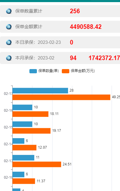
{
"xAxisIndex":0,
"yAxisIndex":0,
"yAxis": {"type": "category", "axisLabel": {"margin":-2},
"nameTextStyle":{"padding":[0,150,150,150]} },
"xAxis": { },
"legend": {"show": true },
"label":{"show":true,"position":"right", "valueAnimation": true},
"series": [{ "type": "bar","color":"#3399CC" },{ "type": "bar","color":"#FF6600" } ]
}
折线图和条形图混合
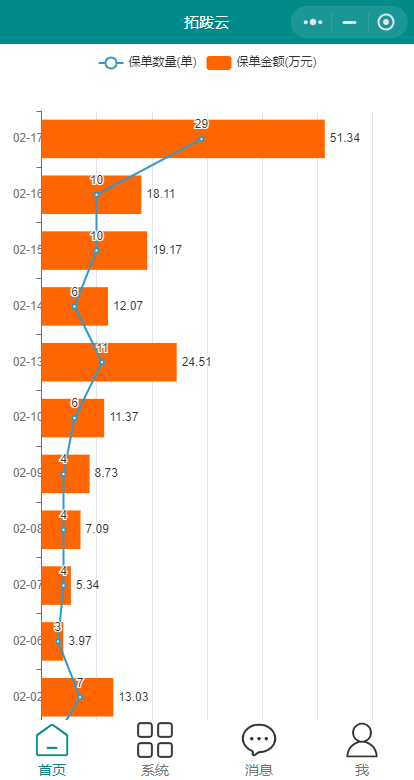
<OPTION>
{
"xAxisIndex":0,
"yAxisIndex":0,
"yAxis": {"type": "category", "axisLabel": {"margin":-2},
"nameTextStyle":{"padding":[0,150,150,150]} },
"xAxis": { },
"legend": {"show": true },
"label":{"show":true,"position":"right", "valueAnimation": true},
"series": [{ "type": "line","color":"#3399CC" },{ "type": "bar","color":"#FF6600" } ]
}</OPTION>
Created with the Personal Edition of HelpNDoc: Free EBook and documentation generator